Brand
Hopted Brand Guidelines
Resources for presenting the Hopted brand consistently and professionally.
Download Brand AssetsNaming
“Hopted” is a single word, always spelled with a capital “H”. It is the brand name of both our company and our application (not “Hopted Connectors”, or “Hopted Extension”).
Usage
Use the wordmark when introducing Hopted, the H/O logo in compact layouts, and the icon on app tiles and social profiles.
Hopted wordmark
When referring to Hopted, choose the wordmark over the standalone logo whenever space allows. We recommend a monochrome version in one of the brand colors shown below.

Hopted logo
Use the H/O logomark in tight layouts, beside the name “Hopted” in plain text, or in grids that show only logos. If your audience may be unfamiliar with Hopted, choose the full wordmark so the brand is easier to recognize.


Hopted icon
You can use the stylized icon to represent Hopted on social media profiles or in compact interface elements such as chips. Match the corner radius to the surrounding design.


Construction and spacing
The H from the wordmark sits beside a solid O. Measure one H from the outer edge of its left stem to the outer edge of its right stem. Center the mark vertically in the rectangular and circle icons and leave one H on each side. On the circle icon, measure from the inner edge of the rim.
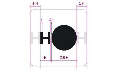
Compact proportions
At 16, 24 and 32 px, center the compact H/O mark vertically on a transparent, borderless square.
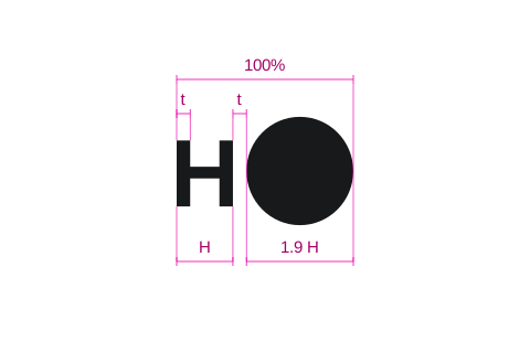







Compact icon example


Colors
Moonstone (off-white) and Obsidian (charcoal) are Hopted’s logo colors. Use Moonstone on dark backgrounds and Obsidian on light backgrounds.
Both gradients run from top to bottom across the whole symbol. The percentages show where each color falls along the gradient.
| 0% | #FFFFFF |
|---|---|
| 18% | #FAFAFA |
| 37% | #ECECEC |
| 59% | #CCCCCC |
| 81% | #ADADAD |
| 100% | #929292 |
| 0% | #575A62 |
|---|---|
| 18% | #53565D |
| 37% | #4B4E55 |
| 59% | #3C3E45 |
| 81% | #2D2F34 |
| 100% | #222326 |